COLOR: METAMORPHOSIS AND HARMONY (PART 2)

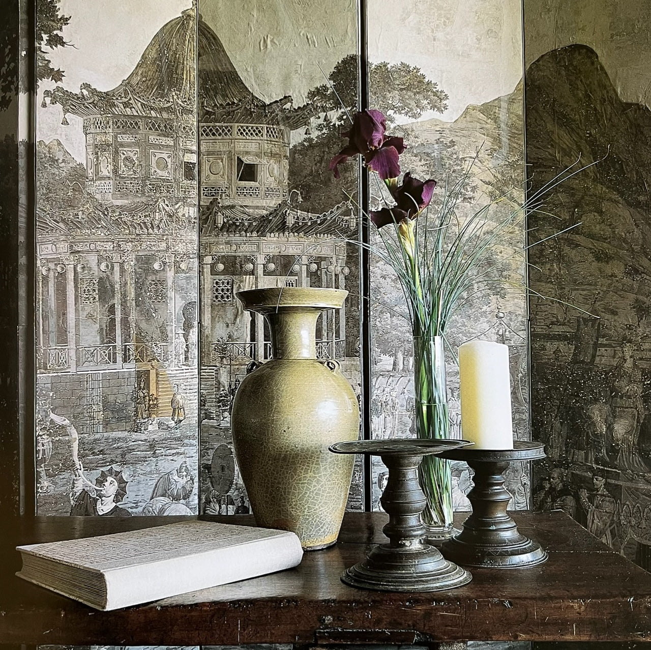
(The screen is made from hand-blocked, early eigtheenth-century wallpaper.)
The most important thing about color is that it cannot be isolated. Every color is only ever seen in juxtaposition with other ones. The importance of juxtaposition can be easily demonstrated if you are trying to choose a white. When you put eight of your favorite whites on a board so they all touch, the color you are looking for will become evident: one white will seem pink, another cream, and another gray-green.
Wherever color is used in the home, it is always a union, a marriage with the occupants of the room, or with the way a room faces, or with what is outside. Colors used in interiors should complement what is visible outdoors. The audacity of a marigold-colored room works in the cold gray northern light of Ireland or Scotland, where there is relatively little bright sun; the brilliance of the color is tempered by the sobriety of the climate. But a room painted the same intense yellow in desert-like Texas would make inhabitants feel on fire indoors. For the same reason, white is generally not a good choice where there is glare outside: for example in Michigan, which is covered in snow for so much of the winter. Instead, I might choose peach or perhaps the green of spring. In contrast, California's veiled light allows the eye to enjoy many shades of white without the associated glare.

(This New York bathroom was decorated in the 1990s. The honey color comes from sycamore wood, stained a deeper-than-natural shade to give warmth to the marble floor and fittings. The rosé-colored wingback chair in the dressing room, and the crown molding, links it to the other rooms in the apartment.)
Color should be used in a way that is appropriate to the environment, so that it reinforces the architecture, balances the natural conditions, and nurtures the souls of the inhabitants of the house. In choosing colors, I often advise clients to follow nature's lead. One particular client loved the peachy gleam of the interior of a sea shell that she had. Her apartment, on a lower floor of a pre-World War Il building in New York City, did not have wonderful views or much natural light, so the sea-shell color in high-gloss paint worked well in her slightly gloomy space. However, she then moved to an apartment on a high floor with a view of the water, where the peach color would not have been so successful. So we concocted a new color that was influenced by the view of the water and the client's collection of celadon ceramics.

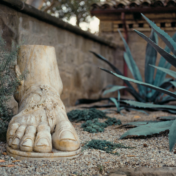
(The palette reflects the hues of the desert vegetation: teal, sage-green, gray, umber, beige, and cream.)
The emotional power of color in the garden – to excite or calm – is brilliantly demonstrated at Sissinghurst, where the garden is designed as a series of enclosed spaces, each of which has its own predominant color theme. Most famous is the White Garden, but, among others, there are also the Cottage Garden, which is planted entirely with fiery, sunset colors that demand attention and seem to give out heat, and the Purple Border, which is a magisterial mix of blues, purples, clarets, and magenta, and creates a brooding, reflective atmosphere.

(The Purple Border at Sissinghurst at midsummer overflows with many of my favorite flower colors. The blues, purples, soft lilacs, and wine-dark reds are here leavened with silvery eryngium and the yellowing hips of Rosa 'Geranium'.)
The colors that I prefer to use in the garden are the cooler tones of blue, lavender, rose, and wine-red, set off with highlights – or rivers of bright, sparkling white and lashings of silvery-gray foliage. I tend to shy away from warmer colors, especially any reds on the orange end of the spectrum.
The colors with a blue bias are the recessive, unassuming colors. They remind us of the sea and sky and far-distant mountains, and create tranquil, restful moods. Hot colors are bold and showy and conjure up an aura of excitement. They are known to raise blood pressure and heart rate and, like strong colors inside, I find them unsettling in large quantities. I do, however, have a planting of scented coral-colored rhododendrons in the wilder section of my garden. In the spring, when they seem to light up the clearing in the woods, their red-gold glow is particularly welcome.

(The terraced area just outside the door that lead to the dinning room at Robin Hill is planted with flowers in blue and white, the colors that show up best in the evening light. I like to make direct links between the garden and house – for example, by planting pots of flowers that bring the wall color from the interior of the house outside.)
Color in a garden does not come just from flowers. I remember lying down in the grass when I was a child and being aware of the taupe color of tree bark, the dark burnt-red of the clinker brick of our family's house, and the differing greens of the elm and ash leaves. Barks, building materials and foliage are all elements to take on board when planning a scheme since in gardens, as in houses, we never see colors in isolation. A red-brick path, for instance, would clash with bright vermilion flowers; so if you want to keep the flowers, you might make the path of beige gravel or mown grass. At Robin Hill the exterior walls, and those that run through the garden, have been left a weathered white to harmonize with the subdued colors of the planting, and the blue-gray gravel was chosen to blend with the slate roof.
The colors of containers and pots need choosing with the same care that you would give to finding the right color for the toss pillows for a sofa, or the porcelain for a dining room. Terra-cotta, for example, is not anonymous; it contributes as much color to a scheme as any strong-hued flower.

(The watered silk on the walls of the drawing room is my response to the clients, who specifically asked me to give them a watermelon-pink backdrop for their superb collection of antiquities. By echoing the color on the ceiling, in the rough-textured roman blinds, and the window woodwork, what might have been a somewhat anonymous space is made into a cocoon.)
Some of the most beautiful gardens are those with no flowers at all; but if foliage and manmade features take center stage, the choice of plants has to be very carefully made. Plants, like rooms, need contrast. But in the same way that juxtaposing various white paints can reveal the minute, yet significant, differences between them, so you will see that when you plant several different greens together some will appear almost black, others chartreuse. A mix of silver, purple, golden, and green leaves, especially when combined with variously shaped leaves, can make a richly rewarding tapestry.